When it comes to building a high-impact product catalog, a standard layout just isn’t enough anymore. If your pages feel like a dense, repetitive spreadsheet, readers will flip right past your best offerings.
A truly successful catalog doesn’t just display products—it creates a tactile, intentional browsing experience. By incorporating unique structural elements, interactive details, and modern layout trends, you can transform your next catalog from a simple list into a powerful sales tool.
Here are some of the best catalog design ideas to elevate your next print project.
Creative Navigation & Edge Details
If your catalog has hundreds of products, helping customers find exactly what they need quickly is essential. Instead of relying solely on a traditional table of contents, let your pages do the navigating.
Interactive & Functional Enhancements
Print catalogs have a massive advantage over digital screens: the power of touch. Adding interactive physical elements increases the time a customer spends holding your catalog.
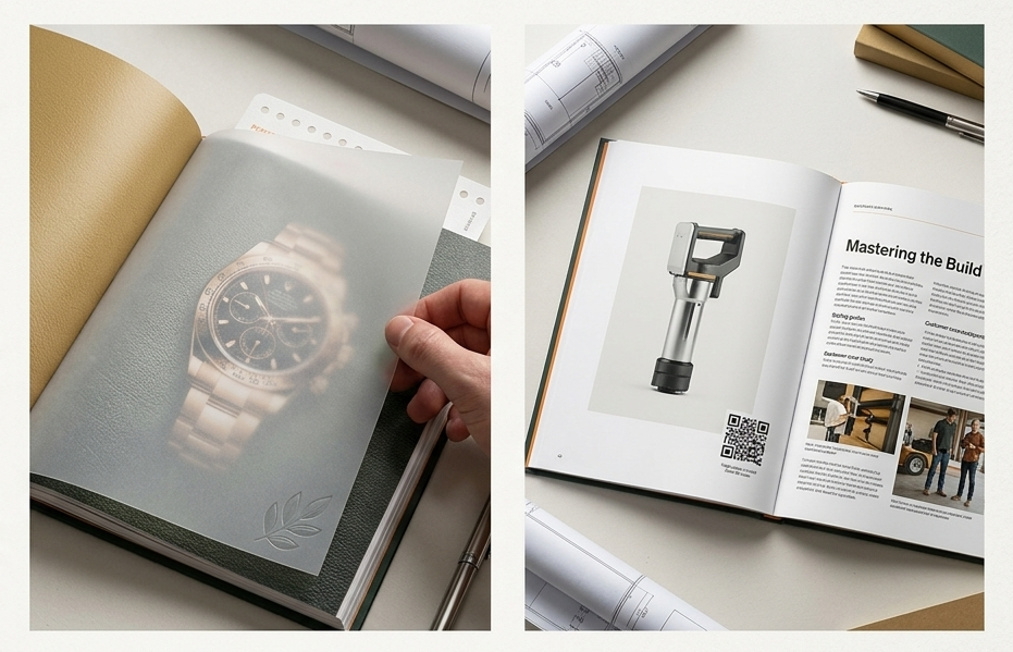
Modern Visual Layouts & Content Trends
The way customers consume print media has evolved. The busiest, most jam-packed catalogs are being phased out in favor of clean, strategic, and hybrid layouts.
Bring Your Next Catalog to Life
The right combination of specialty structural cuts, interactive paper stocks, and clean editorial formatting can turn your catalog into the most effective salesperson on your team.
Planning a new catalog design for your business? Let’s talk about how custom paper choices, unique die-cuts, and premium finishes can make your products stand out.
Contact us today to get started on your custom catalog or magazine.
Frequently Asked Questions
Q: What is a “magalog” and how can it help my business?
A: A magalog is a hybrid between a high-quality magazine and a traditional product catalog. Instead of just listing items, prices, and part numbers, it includes articles, styling tips, industry insights, or customer stories. This approach positions your business as an industry expert and dramatically increases the amount of time customers spend reading your catalog.
Q: Are custom structural options like die-cut thumb tabs and short-shingled pages expensive?
A: While specialized die-cuts and varying page widths require distinct setup configurations during production, they offer an incredibly high return on investment by making your catalog uniquely memorable. If you are on a tight budget, you can easily mimic the visual ease of thumb tabs by printing distinct, color-coded blocks right along the edge of the pages to serve as an instant visual navigation guide.
Q: Why should I leave white space in a catalog when I have so many products to show?
A: Packing too many products onto a single page creates visual clutter, which leads to buyer fatigue and can cause your best-selling items to get completely overlooked. Strategic white space gives the reader’s eyes a place to rest, elevates the perceived value of your items, and guides the customer’s focus exactly where you want it—on your hero products.
Q: What is the best way to use QR codes in a print catalog?
A: Keep them clean, branded, and highly purposeful. Rather than just dropping a generic QR code that links to your homepage, place them directly next to specific, high-interest products. Use them to bridge the gap to digital experiences that print can’t provide, such as linking directly to an online video demonstration, real-time inventory levels, or an instant “add-to-cart” landing page.