The Psychology of Color in Printed Marketing Materials

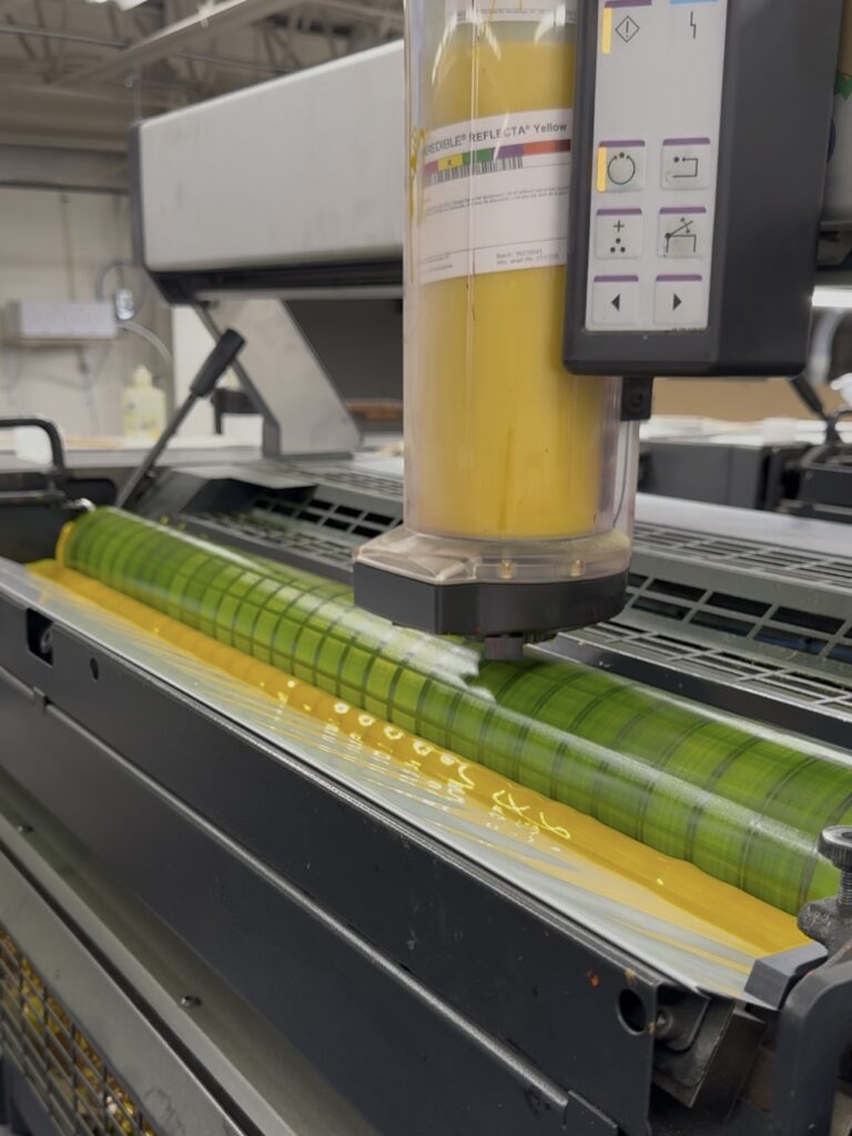
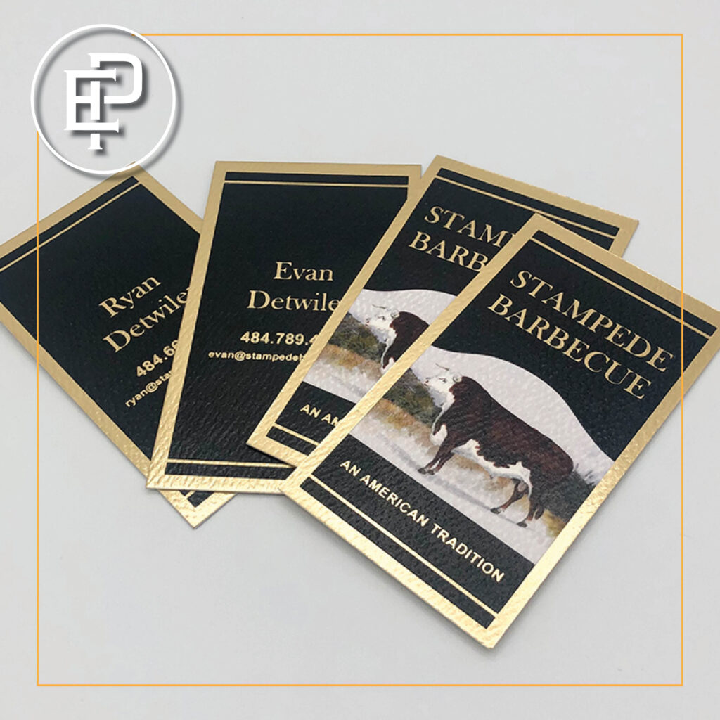
Color plays a powerful role in shaping emotions, influencing decisions, and reinforcing brand identity. When used strategically in printed marketing materials, colors can enhance messaging, improve brand recognition, and drive customer engagement. Our powerhouse commercial press, Heidelberg Speedmaster CD 102, allows us to meet the high standards our clients expect while accommodating a wide range of printing needs. It constantly produces accurate color matching.

Let’s explore the psychology behind different colors and how businesses can use them effectively in print marketing.

The Meaning Behind Colors

  • Red: Energy, Passion, and Urgency
    Red is an attention-grabbing color associated with excitement, urgency, and action. It’s commonly used in clearance sales, call-to-action buttons, and food industry advertising to stimulate appetite and encourage impulse buying. Best for: Sales promotions, restaurant menus, and event flyers.

Best for: Sales promotions, restaurant menus, and event flyers.

  • Blue: Trust, Stability, and Professionalism
    Blue conveys a sense of trust and dependability, making it a favorite in corporate branding and financial institutions. It is calming and reliable, helping businesses build credibility and customer loyalty.

Best for: Business cards, letterheads, and professional brochures and pocket folders.

  • Yellow: Optimism, Warmth, and Attention
    Bright and cheerful, yellow evokes happiness and positivity. It can be a great choice for grabbing attention, but too much can be overwhelming. Pairing it with a neutral or contrasting color helps balance its vibrancy.

Best for: Flyers, direct mail campaigns, and product packaging.

  • Green: Growth, Health, and Sustainability
    Green represents nature, balance, and renewal. It’s commonly used by eco-friendly brands, health industries, and financial institutions to symbolize wealth and well-being.

Best for: Organic product packaging, wellness brochures, note pads, and financial service and landscaping ads.

  • Orange: Enthusiasm, Creativity, and Playfulness
    Orange combines the energy of red and the optimism of yellow, making it a dynamic and friendly color. It’s ideal for brands that want to appear approachable and innovative.

Best for: Event invitations, call-to-action signage, and youth-focused marketing.

  • Purple: Luxury, Wisdom, and Creativity
    Purple is often linked to sophistication, royalty, and imagination. It’s a great color for brands that want to convey exclusivity or a sense of luxury.

Best for:  Premium product brochures, beauty industry materials, and creative branding.

  • Black: Elegance, Authority, and Sophistication
    Black exudes power, professionalism, and elegance. It’s often used in high-end branding and minimalist design.

Best for:  Luxury brand packaging, business cards, and high-end marketing materials.

  • White: Simplicity, Purity, and Cleanliness
    White represents minimalism, clarity, and openness. It is often used in healthcare, tech, and luxury branding to create a clean and modern look.

Best for:  Medical brochures, corporate stationery, and minimalist designs.

Using Color Strategically in Print Marketing

  1. Know Your Audience – Choose colors that resonate with your target demographic. For example, bright colors may appeal to younger audiences, while professional tones like blue and black work well for corporate clients.
  2. Stay On-Brand – Consistent use of brand colors in marketing materials helps reinforce brand identity and recognition.
  3. Create Contrast – Pairing contrasting colors can improve readability and ensure key messages stand out.
  4. Consider Cultural Associations – Colors can have different meanings in various cultures, so be mindful when targeting international audiences.

Test and Analyze – Experiment with different color combinations in printed materials and track customer responses to find what works best.

Color is more than just a visual element—it’s a psychological tool that influences emotions and behaviors. By strategically using colors in printed marketing materials, businesses can strengthen brand identity, enhance customer engagement, and drive desired actions.

Need help choosing the right colors for your next print project? Executive Printing is here to bring your vision to life with expert printing and mailing services. Contact us today for a free consultation.

I’ve used Executive Printing for several years for designing, printing, and mailing.
I have found their work to be impeccable, with a staff that is friendly and easy to
work with. Executive Printing has always been very prompt in service and
communications. I highly recommend them! — Becky Riley